~60% drop in support tickets
B2B SaaS - Product Design
A single feature request — "add refunds" — revealed a broken financial architecture. Here's how we fixed it by introducing a wallet as the source of truth.

Domain
Payments
Platform
Web Platform (B2B SaaS)
Company
Attina.ai
My Role
Lead Product Designer
Timeline
Less than 2 weeks
Team
1 Designer, 2 Engineers, 1 PM
01
CONTEXT
We were building financial tooling for academy operators — the people running coaching institutes, tutoring centres, and online courses. They managed student payments, dues, and batch enrollments all inside our platform.
One day, a key customer asked: "Can we add refunds?"
What sounded like a 2-day feature turned into a 10-week architectural redesign. This is the story of why — and how we shipped something better than what anyone asked for.
BUSINESS STAKES
We were building financial tooling for academy operators — the people running coaching institutes, tutoring centres, and online courses. They managed student payments, dues, and batch enrollments all inside our platform.
One day, a key customer asked: "Can we add refunds?"
What sounded like a 2-day feature turned into a 10-week architectural redesign. This is the story of why — and how we shipped something better than what anyone asked for.
02
MY ROLES & CONSTRAINTS
I was the sole designer on this project, responsible for end-to-end UX — from system mapping to the final UI shipped in production.
I Owned
Mapping the current financial data model and its failure points
Designing the new wallet-first architecture logic (in partnership with engineering)
All user flows, states, edge cases, and error handling
Stakeholder presentations and getting sign-off on the architectural shift
Real constraints I worked within:
01
No redesign budget
Had to work within existing design system — couldn't rebuild the UI from scratch.
02
Live data migration risk
Hundreds of existing invoices and payments couldn't be disrupted by the architectural change.
03
Non-technical users
Academy operators are not accountants. The new flow had to feel simple even if the backend was complex.
04
Accounting accuracy requirement
Financial documents (credit notes) had to meet real accounting standards, not just "look right."
Senior signal: The most important constraint was that engineers had already scoped a simpler (wrong) solution. I had to make the case that we were solving the wrong problem before we could solve the right one.
03
DISCOVERY
We ran 6 operator interviews and 2 weeks of support ticket analysis. Here's what actually mattered:
Research methods used:
Support ticket audit (n=47 tickets) — Tagged every payment-related complaint over 3 months. 62% involved invoice edits, partial payments, or "money confusion."
Operator interviews (n=6) — Semi-structured. Question: "Walk me through what happens when a student asks for a refund today." Every operator described a different workaround.
Accounting system benchmarking — Reviewed how Tally, Zoho Books, and QuickBooks handle credit notes and wallet credits. They all separate money from invoices.
We did NOT do usability testing on early prototypes — timeline didn't allow it. This is a gap I'd fix if given more time.
The insight that changed everything:
"
The problem wasn't "we don't have a refund button." The problem was that money had no neutral state. It was always attached to something, which made it impossible to move freely.
CRITICAL FINDINGS
In every operator interview, when asked about partial refunds or batch transfers, they described a workaround involving either manually editing invoice amounts or calling our support team. This wasn't a UX problem — it was an architecture problem wearing a UX costume.

04
PROBLEM DEFINITION
We were asked to "add refunds." But the real problem was deeper:
"Add a refund button to invoices"
"Design a financial system where money can exist in a neutral, transferable state"
60%
Support tickets related to payment resolution
0
Backend ops interventions required for refund/transfer
100%
Refund actions auto-generate accounting documents
<3
Time for operator to process a full or partial refund
Note for reviewers: Setting these metrics before designing was deliberate. It forced us to validate the solution against real outcomes, not just ship and hope.
Design principles for this project:
Money always has a state — At any point, every rupee should be traceable to: wallet, invoice, or external.
Actions generate documents — Every financial movement creates an audit trail automatically. No silent edits.
Simplicity on top of rigour — The underlying model should be accountant-grade. The UI should feel like a button.
05
SOLUTION
The core architectural shift was simple to describe, hard to get right in practice:


The 3 key design decisions (and why):
Decision 01 — Auto-generating credit notes
Accounting accuracy
The Tension
Operators just wanted money moved. Generating a "credit note" felt like added complexity they didn't ask for.
The Rationale
In accounting, reducing invoice revenue without documentation is a compliance risk. Credit notes protect the business legally. We auto-generated them silently — operators never had to think about it, but the document existed when they needed it.
Decision 02 — Wallet is invisible until it has balance
Progressive disclosure
The Tension
A wallet concept adds cognitive load. Operators would ask "what is this?" if they saw it with a ₹0 balance.
The Rationale
We applied progressive disclosure — the wallet only surfaces in the UI when it holds funds. Zero-state visibility was removed. This kept the experience clean while preserving the system's power.
Decision 03 — "Refund" vs "Move to Wallet"
Mental model alignment
The Tension
Technically, both actions do the same thing (invoice → wallet). But "refund" implies money leaves the system, while "credit wallet" suggests it stays. Operators had different mental models.
The Rationale
We split the action into two explicit steps: (1) Issue credit note → money returns to wallet. (2) Choose: send to bank OR apply to new invoice. This matched how operators already thought about refunds: "first I take the money back, then I decide what to do with it."
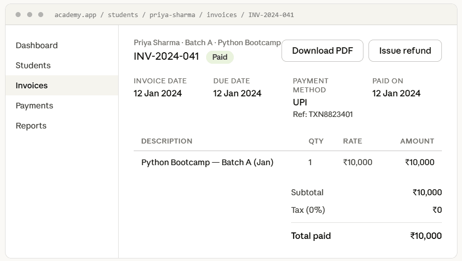


Illustrative mockup - production UI is confidential.
06
IMPACT
We measured 6 weeks post-launch against the metrics we set in the problem definition phase. Here's the honest picture:
58%
Payment-related support tickets (target was 60%)
0
Backend interventions needed for any refund or transfer
2.1 min
Avg time to process a full refund (was ~35 min)
100%
Refund actions generating credit notes automatically
QUALITATIVE OUTCOME
One enterprise customer told us: "This is the first time I felt like the platform actually understood how money works." That sentence became the headline of our next sales deck.
Before vs After — support ticket breakdown:
→ At 10 tickets/day @ ~30 min avg handling time, the 58% reduction reclaimed ~87 support hours/month — the equivalent of 1 full-time support agent's capacity redirected to growth.
→ Zero backend interventions means the ops team stopped being a bottleneck in the refund loop — directly protecting NRR by reducing churn risk from frustrated operators.
→ The enterprise customer quote ("first time I felt the platform understood money") became a sales asset — used in the next sales deck.

Where the results were mixed: 2 operators found the wallet concept confusing initially — they expected money to just disappear on refund. We addressed this with clearer copy and a one-time onboarding tooltip. This is worth including in a case study — it shows you monitored real behaviour post-launch.
07
REFLECTION
What worked:
Reframing the brief early saved weeks of building the wrong thing. The support ticket audit was 2 days of work that changed everything.
Benchmarking real accounting tools (Tally, Zoho) gave me credibility with engineering when I proposed credit notes. I wasn't inventing accounting — I was copying the right model.
Defining success metrics before designing forced honest evaluation. No "I think it went well." Numbers against a prior commitment.
What I'd change:
I would have run 1–2 usability sessions on the "wallet" mental model before shipping. The confusion we saw post-launch was predictable in hindsight.
The credit note document design was rushed — it looked like a system dump. I'd dedicate more time to making financial documents feel trustworthy and polished.
What this changed about how I work:
"
When someone asks for a feature, the first question I ask now is: "What would need to be true in the system for this feature to exist cleanly?" If the answer is "a lot," the real work is architectural — not visual.