The Tiny Editor That Packs a Punch
Designing a text editor isn’t just about tossing in B I U and calling it a day. It’s about creating a space where users can think less and write more.
Big Names Doing It Right







What I built
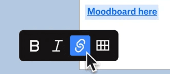
A minimal editor UI with only the essentials—bold, italic, underline, text styles, colors, lists, alignment, and links. Clean. Compact. Familiar.
Why it works
Familiar icons = zero learning curve (📎 Jakob’s Law: users expect familiar patterns).
Minimal UI = less cognitive load (✨ Hick’s Law in action).
Instant feedback = better user flow (95% of users say responsiveness boosts satisfaction – NNGroup).
Real-world inspo
Think Notion meets Medium—but lighter and faster for everyday use.
Designing this was about asking: What’s the least I can show that lets users do the most?
